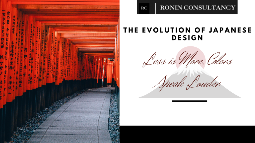
The simplicity, accuracy, and attention to detail of Japanese design have long been praised. It has undergone a significant transformation over time, reflecting evolving fashions and technological developments. In recent years, we have seen a move toward a minimalist aesthetic, embracing bold colors and incorporating modern components like QR codes and English text to produce powerful designs that appeal to a wide audience.
Read more: https://roninconsultancy.com/japans-latest-digital-marketing-trends-in-2023/

1. Less is More
Japanese design has historically been distinguished by its minimalist aesthetic, where each element has a purpose and is meticulously balanced to create harmony. In the past, pamphlets and promotional materials were no exception. However, recent years have seen a discernible change. Less information is now being included on pamphlets and advertisements by Japanese designers, who are adopting the maxim “less is more.”
Multiple benefits result from this move toward simplicity. First of all, it lessens distractions and helps the audience concentrate on the most important ideas. This simplified strategy makes sure that the message is conveyed effectively in a world where information overload is a constant problem. Second, it evokes the elegance and sophistication that are frequently associated with Japanese design. Designers can make a strong statement only using a limited number of carefully selected words, eliminating extraneous components.
2. QR Codes and English Text
The incorporation of QR codes and English text is one of the most striking developments in Japanese design. These additions accomplish two crucial goals: they draw attention to slogans and draw a larger, global audience.
QR codes have become an integral part of Japanese design, especially in marketing and promotional materials. By simply scanning the code with their smartphones, users are given access to more details, websites, or interactive content. The way businesses interact with their customers has completely changed as a result of the seamless blending of digital and print media. The potential of QR codes to improve the user experience and increase engagement has been recognized by Japanese designers.
English text is also included as a strategic move to appeal to a worldwide audience. Incorporating English into design elements makes content more understandable to non-Japanese speakers because it is widely acknowledged as the international language of business. This strategy supports Japan’s expanding global presence and makes it easier to communicate with a wider demographic.
3. Color Palette
The use of more vibrant colors, such as yellow and red, than previously is another notable change in Japanese design. Japanese design has traditionally favored muted, earthy colors that are frequently drawn from nature. Although these hues still have cultural significance, designers are now using bolder, more vibrant colors to make a visual statement.
Particularly yellow has become more popular in modern Japanese design. It stands for innovation, vigor, and positivity. Designers hope to convey a sense of optimism and modernity in their works by making yellow a prominent color. On the other hand, red exudes passion, power, and vitality. Its incorporation into design elements gives promotional materials a dynamic and attention-grabbing dimension.
With the adoption of a more minimalist aesthetic, the incorporation of QR codes and English text, and the exploration of vivid colors, Japanese design has undergone a significant evolution. The ability of Japan to adapt to a rapidly shifting global environment while maintaining the fundamental ideals of simplicity and accuracy that have characterized its design heritage is reflected in these changes. The development of Japanese design not only highlights its applicability in the contemporary era but also highlights its capacity to enthrall and engage a diverse and international audience. Japanese designers will undoubtedly continue to be at the forefront of innovation and creativity as the design world changes.
